Designing the layout of Web pages
< back to Totton College Web Design weekly course or homepage
I recommend you design primarily for 1024 pixels wide x 768 pixels high
 |
Within this 1024 x 768 physical screen size, Dreamweaver conservatively suggests that you keep all important information within 955 pixels wide by 600 pixels high as shown in the screen capture left, but most browsers should allow quite a lot more of your page to display, perhaps 960 pixels wide by 640 deep. The address bar, status bars, bookmark bars and scroll bars account for the difference, and some Firefox users will have added the Google taskbar too, which adds features including translation. This bordering area, used up by the browser itself, is known as 'chrome', hence the name chosen by Google for its own browser:
|
As well as being a long-established standard XGA, 1024 x 768 is also the exact pixel count of the Apple iPad
In practice people will view your page with many different browsers on many different devices, but by planning everything within this 1024 x 768 pixel area computer users will have their expected experience, and people using smart phones accept the need to scroll around (or on the iPhone, zoom in) but they would of course appreciate a special site designed for mobile users, with minimal graphics to reduce download lag. iPhone/iPod Touch and many smartphones have a resolution of 320 × 480 pixels.
Anything not within about 960 pixels wide by 640 deep will most likely never be seen by your audience. Statistics indicate that only 25% scroll down below the 'fold' at the bottom of their screen on first impression of your page, and less than 10% scroll sideways. The rest either click something they can see (a link, button or ad) or worse, hit the close or back buttons.
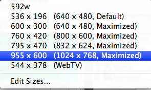
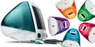
Most computer users can choose to set their monitors to various resolutions. It is possible to make up the screen image with fewer large pixels or many more smaller ones - but type ten small pixels high will look proportionally smaller than the same type ten large pixels high. For example on Apple's original little CRT iMacs introduced in 1998 the physical monitor is a constant 15 inches diagonal from corner to corner. Users could set this to display one of three possible resolutions:
 |
|
article on 72 dpi and resizing images at webdesignerdepot.com
'Think different' Mac and PC font sizes
To further complicate matters, Apple Macs used to display type at different sizes from PCs. Macs show type at 72 pixels per inch (ppi), following hundreds of years of typographic convention whereby a typeface is measured in points (normal reading size varies between 8 to 12 points). Pixel is short for PICture ELement by the way.
There are approximately 72 points to the inch and so in 1984 the desktop publishing Macintosh sensibly used 72 pixels per inch for its screen resolution. As a result, when you looked at 12 point type or drew a line five points wide, it really was that size on screen. This was part of WYSIWYG (pronounced 'wizzywig') an acronym for 'what you see is what you get'.
IBM-compatible Windows PCs are from a different tradition of business and office use and flout the convention by displaying web type at 92 ppi. Since Microsoft has the power to set its own standards despite reason or opposition from Apple, Sun or the official governor of standards the World Wide Web Consortium, this has become the new standard by shear weight of numbers. Type is significantly bigger and more comfortable to read but can result in crowded layouts and an ugly page. Since there are many more Windows PCs than Macs most web pages are designed with Windows in mind - which means the designers initially make type artificially small, ready for Windows browsers to magnify back up to the designer's target size.
Historical footnote: Mac users just had to squint at the unnaturally small type, until the advent of Microsoft's Internet Explorer 5 for Mac. This allowed the best of both worlds as you can set it to display type at any size you wish, including both Windows default of 92 ppi or Mac 72 ppi. Mac based web designers could always check their pages with Explorer 5 set to the PC size for a guide to how the pages will display on a PC (better still, check on an actual PC or use an emulator such as bootcamp, Parallels, RealPC or VirtualPC). As a side-effect, it reduced the unanimous opposition of Mac users against the 92 ppi standard by splitting their viewing demographic. Any users of pre-version 5 Explorer on the Mac will still get the smaller 72ppi type.
< back to Totton College Web Design weekly course or homepage